
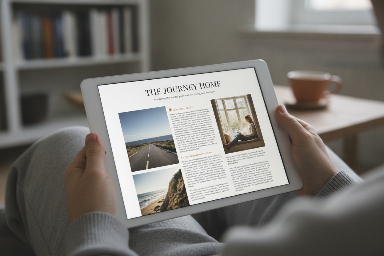
Readable design is one of the most important parts of a successful online magazine. Readers may come for the article, but they stay because the page feels comfortable, clear, and easy to follow. For a publication like Niram Magazine, design should support the writing instead of competing with it. That means careful attention to structure, spacing, and visual hierarchy.
Long-form reading becomes more enjoyable when the page reduces effort. Large enough text, balanced line length, and clean paragraph breaks all help the eye move naturally through the content. A prominent title and a concise introduction give readers immediate orientation, while a well-organized article page encourages them to keep going. These are small details, but they make a major difference in how long someone stays on the site.
Readable design also supports trust. A cluttered page can make even strong writing feel less credible, while a calm, modern layout signals professionalism. That is especially important for a magazine brand that wants to present itself as thoughtful and editorial rather than overly promotional. The design should feel intentional from the homepage to the final paragraph.
For mobile users, readability becomes even more crucial. Many readers will discover Niram Magazine on a phone or tablet, so the content must adapt smoothly without losing impact. Clear navigation, card-based article previews, and consistent spacing all contribute to a better experience. When design and content work together, the result is a magazine that feels easy to read and hard to forget.
Leave a Reply