
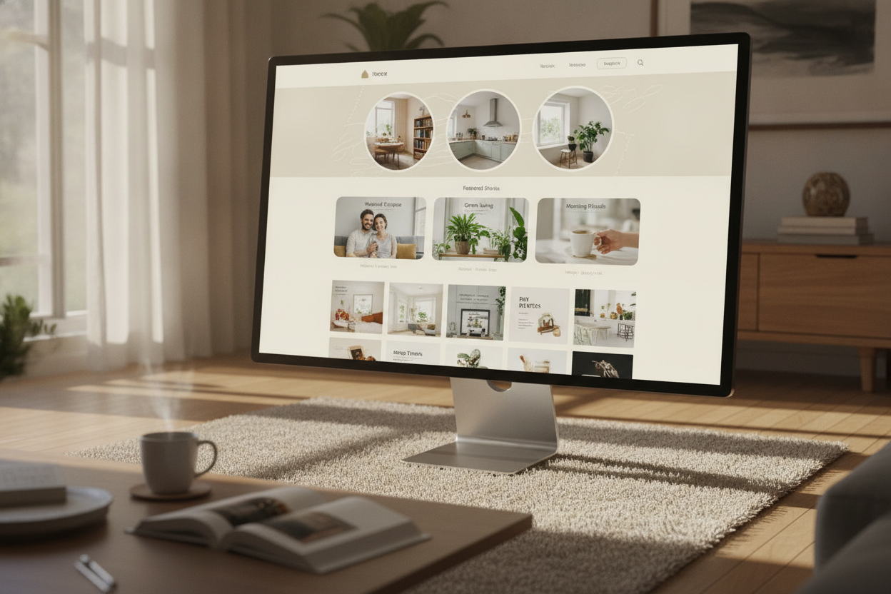
A curated homepage does more than display articles. It sets the tone for the entire magazine experience and helps readers understand what the publication stands for. In a content-driven site like Niram Magazine, the homepage should feel like an editor’s carefully arranged selection rather than a random feed. That sense of intention makes the brand feel more trustworthy and polished.
The best magazine homepages use a clear visual rhythm. Featured stories can appear larger and more prominent, while recent articles sit in a grid or card layout that encourages browsing. This structure helps readers move between topics without feeling lost. It also gives the publication a chance to highlight important stories first, while still keeping the rest of the site accessible.
Curating a homepage is also about editorial judgment. Not every piece needs equal attention, and not every story should compete for the same space. By choosing a few key articles to feature, the site can create a stronger first impression and improve reader flow. That matters for audiences who visit with different goals, whether they are looking for culture coverage, lifestyle ideas, or current events.
For Niram Magazine, the homepage is a brand statement. It should feel modern, readable, and easy to browse on any device. If the layout invites readers in and helps them discover content naturally, the site becomes more than a blog. It becomes a magazine people want to return to, explore, and trust over time.
Leave a Reply